In-class Exercise 5: Emerging Hot Spot Analysis
2025-09-27
Overview
Emerging Hot Spot Analysis (EHSA) is a spatio-temporal analysis method for revealing and describing how hot spot and cold spot areas evolve over time. The analysis consist of four main steps:
- Building a space-time cube,
- Calculating Getis-Ord local Gi* statistic for each bin by using an FDR correction,
- Evaluating these hot and cold spot trends by using Mann-Kendall trend test,
- Categorising each study area location by referring to the resultant trend z-score and p-value for each location with data, and with the hot spot z-score and p-value for each bin.
Important
It is highly recommended to read Emerging Hot Spot Analysis before you continue the exercise.
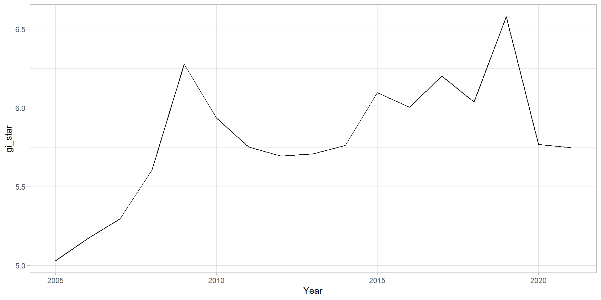
Mann-Kendall Test on Gi
With these Gi* measures we can then evaluate each location for a trend using the Mann-Kendall test. The code chunk below uses Changsha county.
Next, we plot the result by using ggplot2 functions.
Visualising the distribution of EHSA classes
In the code chunk below, ggplot2 functions is used to reveal the distribution of EHSA classes as a bar chart.
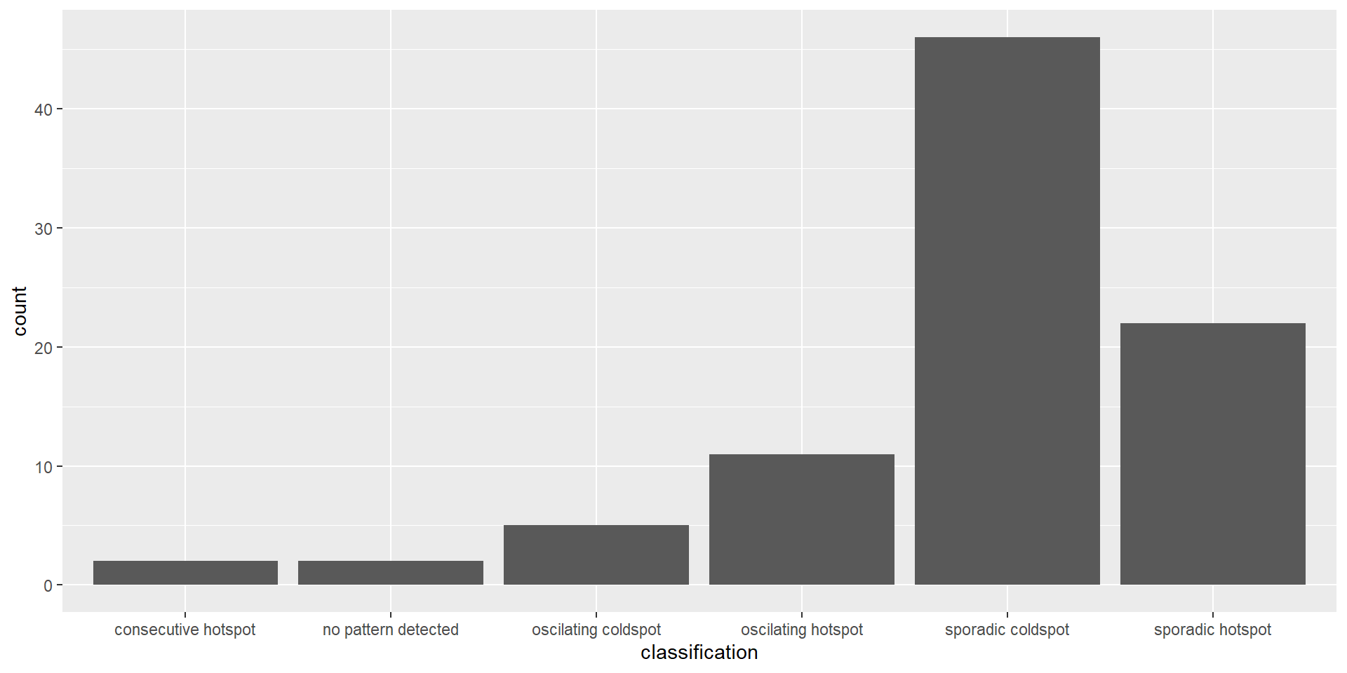
Figure above shows that sporadic cold spots class has the high numbers of county.
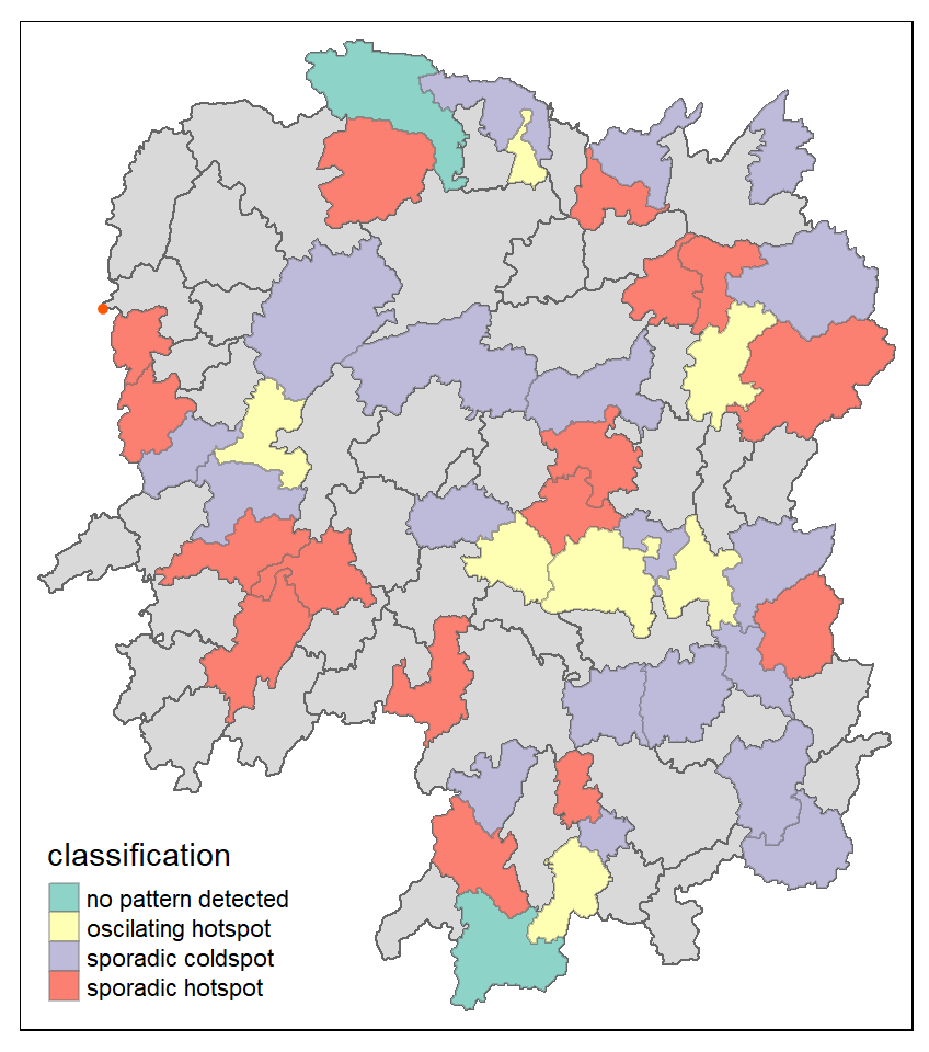
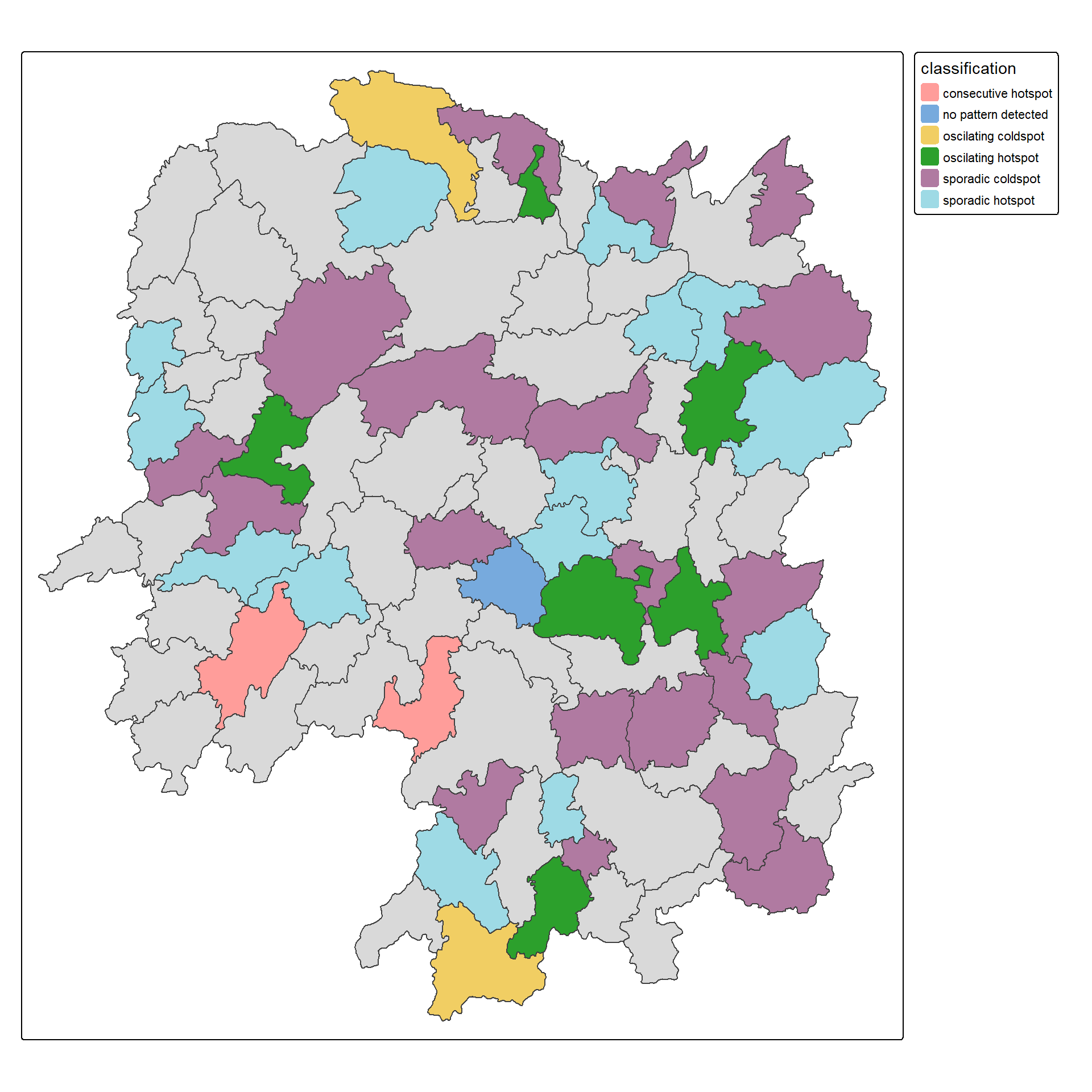
Visualising EHSA
In this section, you will learn how to visualise the geographic distribution EHSA classes. However, before we can do so, we need to join both hunan and ehsa together by using the code chunk below.
Next, tmap functions will be used to plot a categorical choropleth map by using the code chunk below.
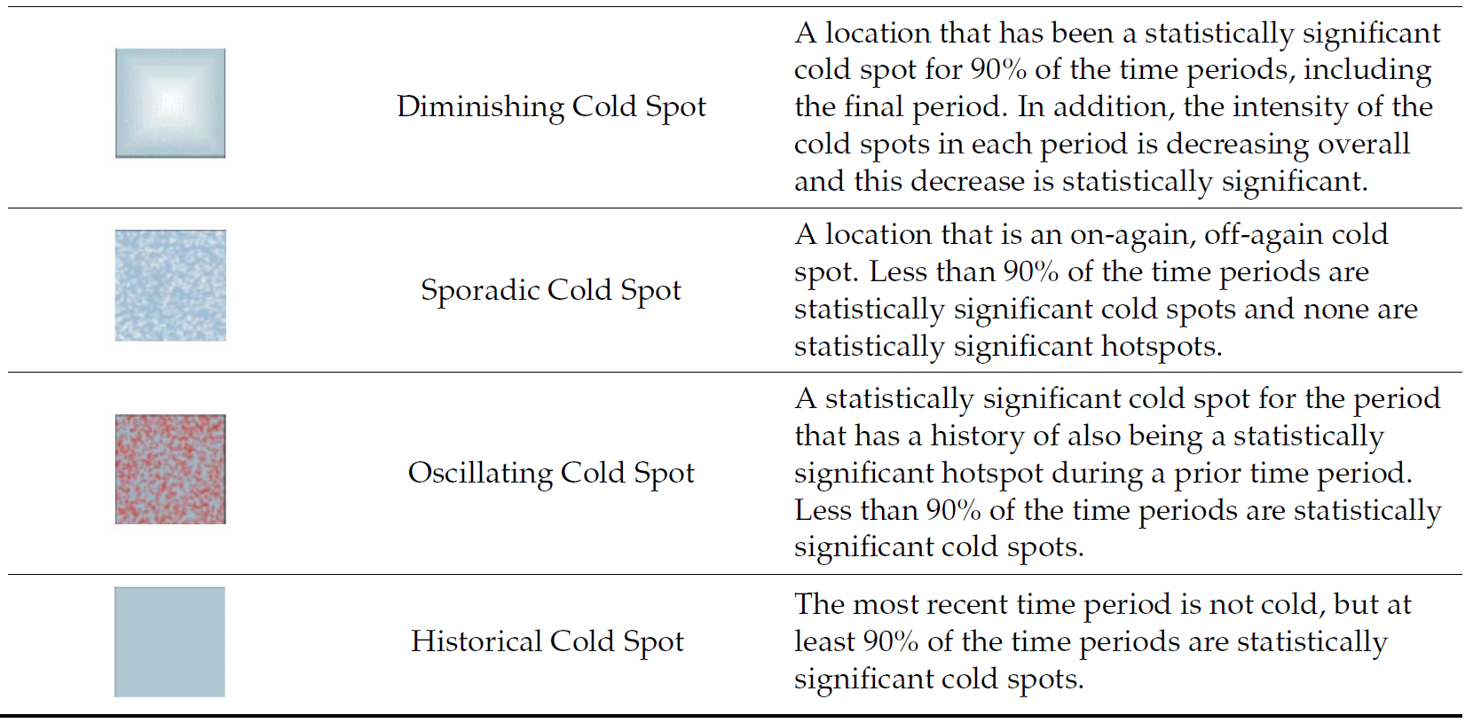
Interpretation of EHSA classes
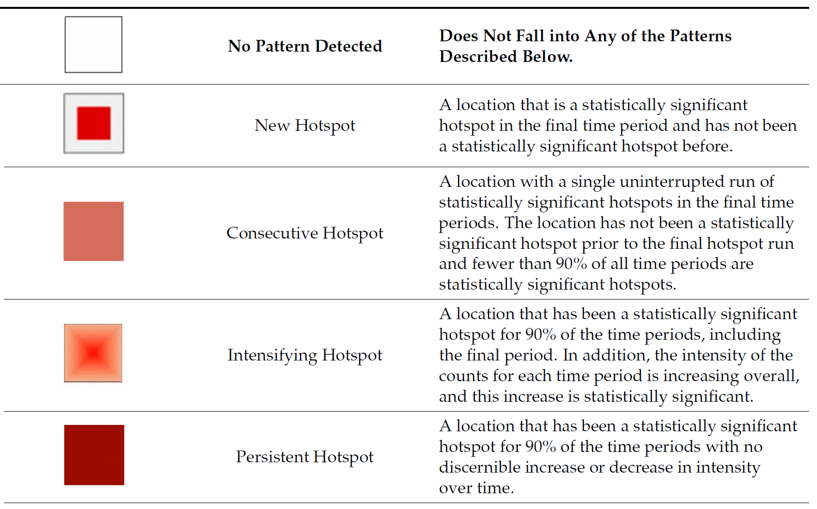
Interpretation of EHSA classes
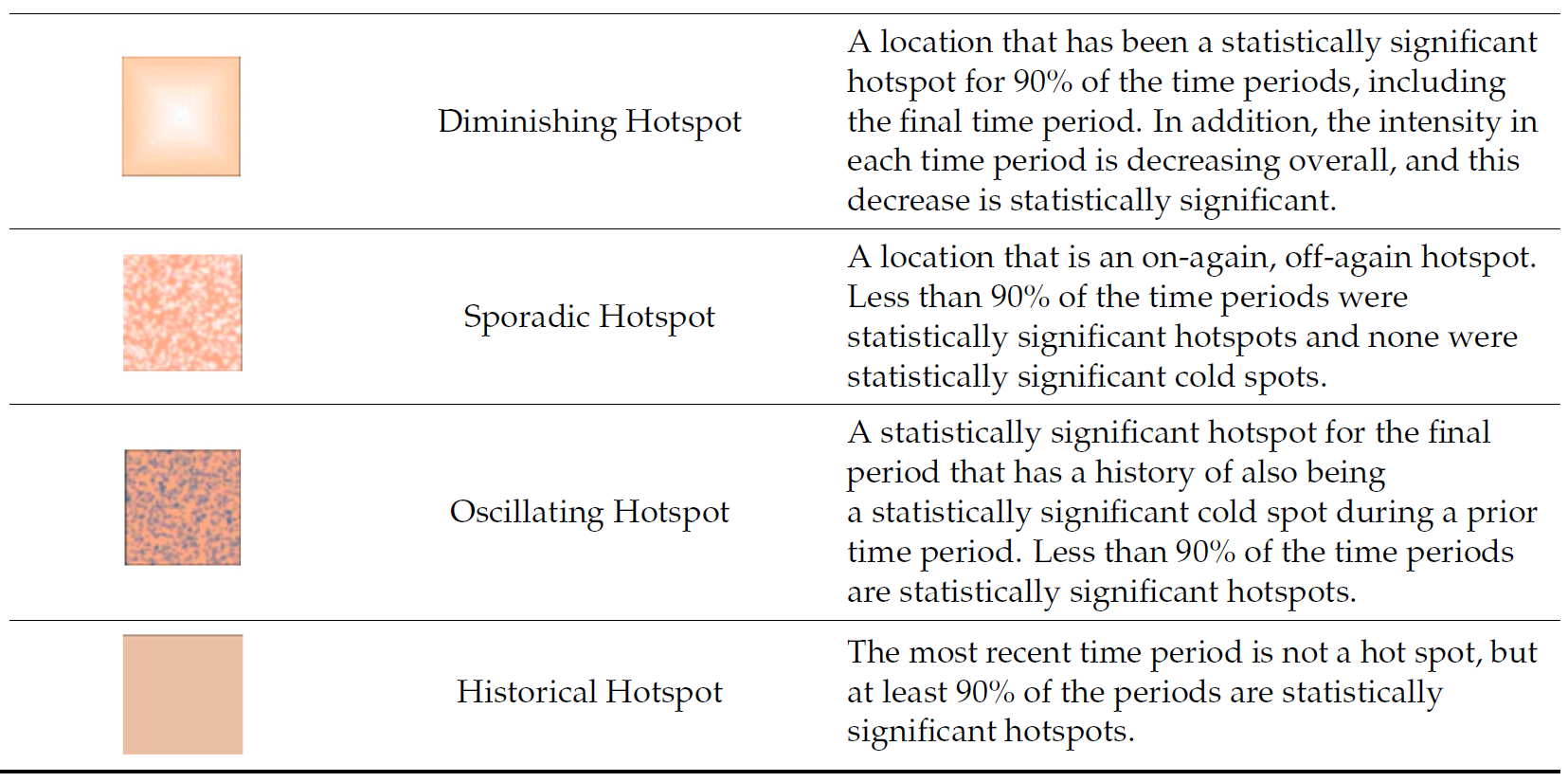
Interpretation of EHSA classes
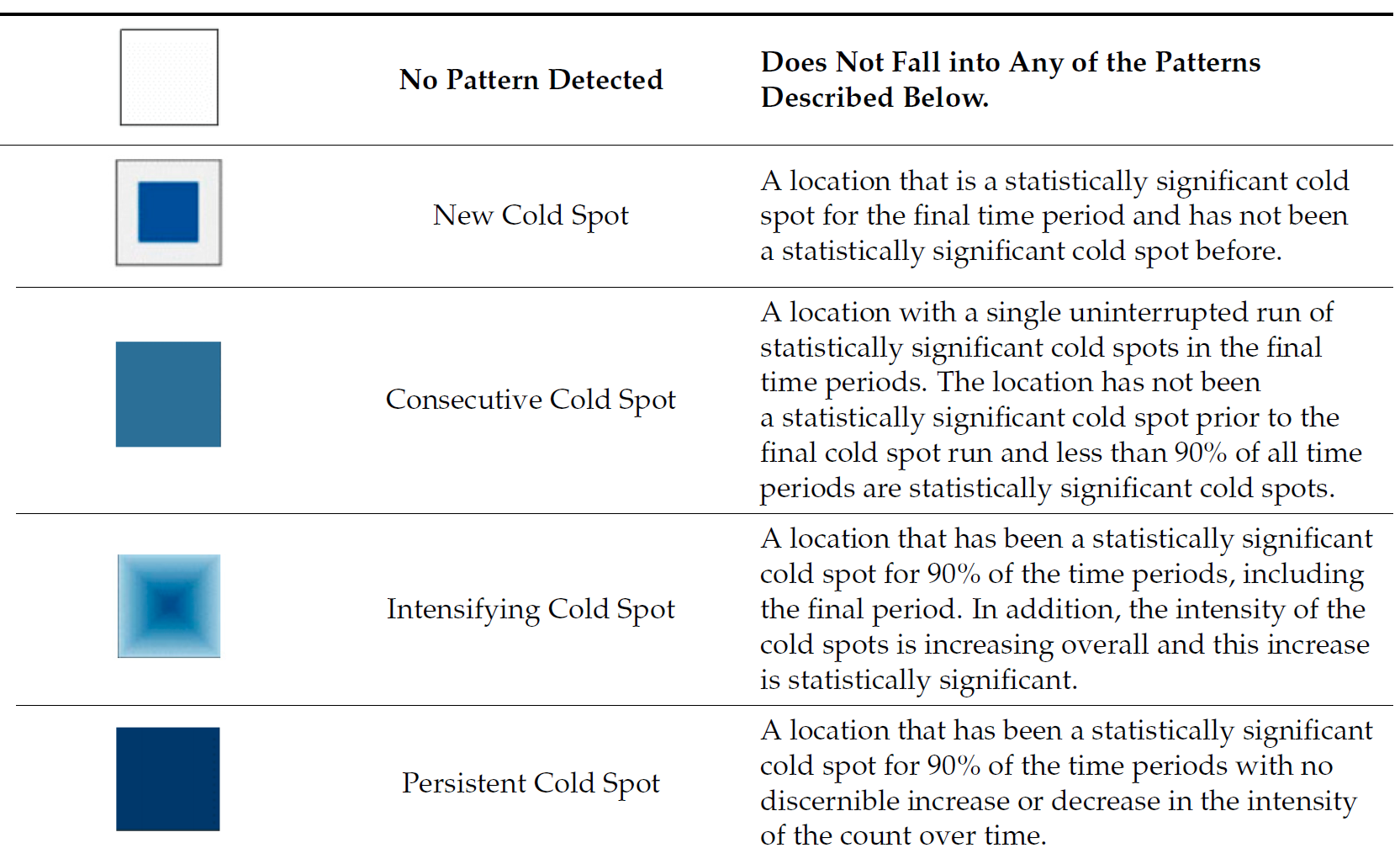
Interpretation of EHSA classes